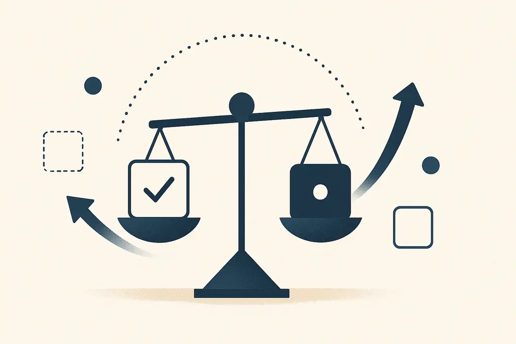
Working definition
Choice architecture for product adoption is the deliberate arrangement of options, information, and decision points to influence whether and how people adopt a product or feature. It includes placement of features in an interface, default settings, step-by-step flows, and the way benefits or trade-offs are described. The aim is not to coerce but to reduce friction, highlight useful choices, and support desired outcomes for both users and the organization.
Key characteristics:
These characteristics work together: defaults reduce decision load, friction directs attention, and framing sets expectations. A manager-oriented approach treats choice architecture as a toolkit for shaping adoption while monitoring outcomes and ethics.
How the pattern gets reinforced
**Default effects:** people often stick with pre-selected options because it's easier and feels safe.
**Choice overload:** too many features or plan options cause indecision and lower conversion.
**Cognitive shortcuts:** users rely on heuristics (e.g., recent items, prominent buttons) rather than full evaluations.
**Social proof:** visible cues like "most users choose X" steer behavior without explicit persuasion.
**Environmental friction:** slow load times, long forms, or unclear labels deter completion.
**Incentive misalignment:** internal KPIs or compensation can shape what options product teams highlight.
**Attention constraints:** limited time and competing tasks make simple, salient options more likely to be chosen.
Operational signs
Low uptake despite positive feedback in interviews: qualitative interest but poor activation metrics.
High abandonment at a specific step in onboarding flows (drop-off spikes visible in analytics).
Heavy reliance on default settings with few users customizing options.
Repeated feature requests that mirror an existing but hard-to-find option.
Sales or support teams nudging customers toward certain packages because they’re easier to sell.
A/B test results where small copy or placement changes produce large adoption swings.
Product teams debating whether to hide or surface advanced settings.
Confusion in cross-functional meetings about why a clearly useful feature is unused.
A quick workplace scenario (4–6 lines, concrete situation)
The product team launches a time-tracking module. Managers notice low activation; analytics show a 60% drop at the account setup screen that asks users to choose billing intervals and permissions. A short pilot replaces the multi-option screen with a recommended default and a brief explainer. Activation rises within two weeks and the team uses the pilot to decide which options should be defaulted for new accounts.
Pressure points
Launching multiple new features simultaneously without clear onboarding paths.
Changing default settings in a release without communicating rationale to users and stakeholders.
Adding more pricing tiers or configuration options to satisfy edge cases.
Conflicting priorities between product, sales, and customer success teams.
Overloaded interfaces where primary actions are visually buried.
Using dense technical language in microcopy or setup flows.
Incentive programs that reward short-term sign-ups over sustained usage.
Ignoring analytics that point to a specific friction point in the funnel.
Moves that actually help
A pragmatic manager view treats these steps as iterative: prioritize the highest-friction decision points, test small changes, measure impact, and scale what works while keeping transparency and user control.
Map the decision journey: document every choice users face from discovery to active use and number the friction points.
Set thoughtful defaults: choose defaults that serve most users and make them easy to change.
Simplify early steps: reduce options at first contact and reveal complexity progressively.
Use clear microcopy: label buttons and fields with outcome-focused language, not internal jargon.
Run focused A/B tests: test one change at a time (placement, wording, default) and measure activation/retention.
Collect qualitative feedback: short interviews or session recordings where users explain why they stopped.
Align teams: ensure sales, CS, marketing, and product agree on the intended adoption path and messaging.
Monitor metrics that matter: activation rate, time-to-first-value, and drop-off points in the funnel.
Pilot before wide release: roll out default changes to segments, then iterate before global changes.
Document ethical choices: make default rationale and opt-out paths visible to avoid surprising users.
Train customer-facing staff: ensure onboarding scripts and demos reinforce the intended choices.
Related, but not the same
Behavioral nudges — Related but broader; nudges are specific tactics (prompts, defaults) used within choice architecture to steer adoption without removing freedom.
Onboarding design — Connects directly: onboarding is the place where choice architecture is executed to convert new users into active ones; onboarding focuses on sequence and first-value delivery.
Defaults and opt-outs — A subset of choice architecture; defaults are powerful levers but need clear opt-out paths and documented rationale.
Friction costs — Describes how time/effort reduces uptake; choice architecture manages friction to improve conversions.
Decision fatigue — A cognitive state where many choices reduce decision quality; choice architecture reduces exposure to unnecessary decisions.
UX writing — Complements choice architecture by crafting the microcopy that frames options and clarifies trade-offs.
A/B testing & experimentation — The empirical method to validate which choice arrangements increase adoption; experimentation tests hypotheses from choice architecture changes.
Social proof & norms — Behavioral cues (reviews, "popular" tags) that interaction designers can place within the architecture to encourage adoption.
Incentive design — While incentives change behavior through rewards, choice architecture arranges the context in which those incentives are noticed and acted on.
Ethical design — A governance layer ensuring choice architecture respects autonomy, consent, and transparency rather than manipulating users.
When the issue goes beyond a quick fix
- If adoption problems persist despite repeated evidence-based experiments, consult a UX researcher or product psychologist for deeper study.
- For large-scale defaults or consent-sensitive changes (privacy, billing), involve legal or compliance counsel before rollout.
- When organizational incentives conflict and cause persistent misalignment, engage an organizational development or HR consultant to resolve systemic issues.
- If workforce stress or role conflict arises from rapid change programs, speak with HR or an organizational psychologist for support and structured interventions.
Related topics worth exploring
These suggestions are picked from nearby themes and article context, not just a flat alphabetical list.
Group choice deferral
When teams repeatedly postpone choices in meetings, work stalls. Learn to spot the signs, why it persists, and practical fixes—deciders, timeboxing, defaults, and decision rules.
Paradox of choice at work
How extra options at work—tools, vendors, processes—create delays, doubt, and lower throughput, and what practical levers managers and teams can use to restore clarity and speed.
Project portfolio choice overload
When too many projects compete for attention, decisions stall and resources scatter. Practical guide to recognizing causes, everyday signs, and manager-level fixes.
Choice-supportive memory in postmortems
How teams remember their own choices more kindly in postmortems—and simple practices to surface the true decision record so reviews yield real learning.
Decoy Effect: How Product Positioning Steers Decisions
How adding a clearly inferior option shifts workplace choices — why it happens, how it shows up in proposals and pricing, and how to spot and reduce it.
Pre-mortem planning
A practical guide to running pre-mortem planning in team meetings: imagine failure, identify causes, and turn insights into tests, owners, and early mitigations.